WM

Objectives of the Project
As an established beauty product review website, it had aged and needed a complete rewrite on a more modern platform - Django. The current site was slow and frustrating to use. While upgrading the platform for scalability and additional features, the site got a facelift. The new design was created by an outside firm and assumed to be complete.


Opportunity


Background
Beautytap was introduced as an e-commerce site approximately seven years ago. Its success is due to fully vetted industry Beauty Experts trying products and writing reviews. Brands are incentivized and also fully vetted before they can add new products for review. The site has found great success and attracted some top-name Beauty Experts, popular Brands, and many celebrities.
The plan going forward is more focused on the Experts and Brands to get the word out. The e-commerce has been removed or postponed at this time. The general functionality will still be familiar, but a new elegance and modern touch will be added.
Two new features will be a global search and an activity awards program to encourage site engagement and promotion.

Initial Project Status
- a tale of woah!
-
The design was incomplete and did not define MVP - rescoped to 50% of the design for MVP site replacement.
-
No Personas, User Journeys, IA, or Style Guide were provided
-
Despite that, development had been proceeding for 2 months - cost $30k/mo


Steps to Get the Project Delivered
Development had begun based only on a design with functionality not needed for the MVP and features the data could not support.
To get the project on track and focused on a timely deliverable, I took these 8 steps to create a cohesive team, easy-to-follow requirements, and a happy client.

8 Steps to Get Back On Track
1
2
3
4
5
6
7
8
Worked with the client to identify MVP features
Focusing on the home page, we quickly filled in the design to get the developers back on track. This allowed us to continue working through each screen to rescope for MVP.
We did this by defining Personas, creating numerous User Journeys, and sorting the feature list into 3 priorities:

1
2
3
4
5
6
7
8
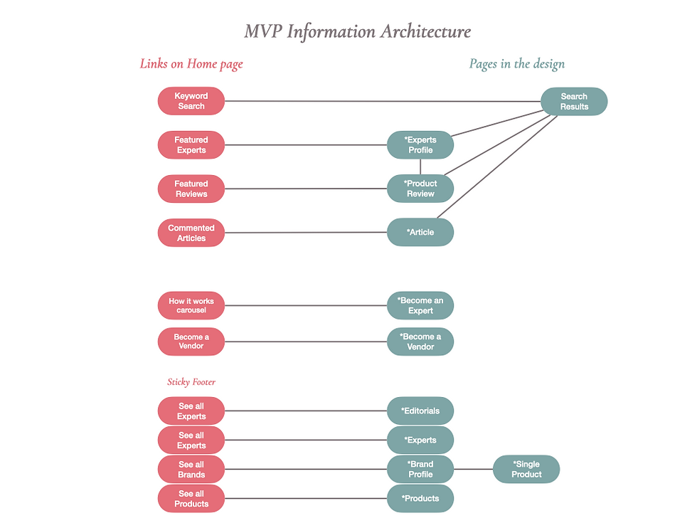
Created Information Architecture to identify gaps and usability issues
* And this was only the home page!
Within the first few weeks, I realized the lack of MVP in the current design as well as significant UX issues. I worked with the client on a proper IA process and closed all the gaps as illustrated below.
Using the IA to fix the UX
-
Identified gaps
-
Removed broken links
-
Designed Search Results Page
-
Designed other missing pages
-
Focused on Search & Filters
-
Added 3 filter results pages
-
Fixed Sticky Footer navigation
Success!
Usability greatly improved


Good >
* Primary Pages
Pages
Links
Bad >
Not in MVP
Missing Pages
Broken Links
Data not available

1
2
3
4
5
6
7
8
Developed Style Guide and Assets to create consistency and faster development
Style Guides are imperative to maintain consistency and build quickly. They are the foundation of a great UX. A Graphic Artist created the original designs and a few key features, such as this "fingerprint" background design and the color palette. The font was licensed, so we changed it to an open-source font.
I also created color and pattern styles for the 3 key elements - Product Reviews, Product Likes, and Article Comments.
This is a sample, but the Style Guide is quite robust in both XD and Zeplin.

1
2
3
4
5
6
7
8
Did a significant update to the XD files to match the feature list, IA and Style Guide
With the new IA, MVP Feature List, and Style Guide in hand, the changes to the interface went much quicker. As I finished each page or even just a section of a page, I handed it to dev so they could continue progressing on the rework from the original flawed design.
The requirements were in Zeplin. The images below show the number of changes, which is but a small sample of the design modifications.
 |  |  |
|---|---|---|
 |
1
2
3
4
5
6
7
8
Created User Jouneys and Prototyping by linking XD to Zeplin
Zeplin's Flows and Styleguides are excellent for giving clear, easy-to-follow directions on complicated navigation.
A picture or diagram IS worth 1000 words. This User Journey explains that the user goes to the same page with one difference depending on the link.
There is one Product Page and 2 links to get there - View Product and View Product Review. The View Product Review will unhide a section on the product page to display that particular review.
This is the main goal of this side - Expert Reviews and Products being reviewed.
I created many of these flows to describe the slightly less intuitive design elements so the user will have a seamless experience.

1
2
3
4
5
6
7
8
Provided Zeplin files to dev for CSS and exact user flows
Of course, Zeplin is the way to go for pixel-perfect designs, but when your project is over-budget and way behind, this is a life-saver. The team could take these CSS components and know that they could replace or add to what was there. Once we implemented this, the pages came flying out of QA.

1
2
3
4
5
6
7
8
Created User Stories in JIRA for additional clarity, priority and tracking of the work
On my first day on the project, I received a 50 page Word doc with questions about the design from the BA with the team.
I put each question with marked up screenshots into Jira as a Design Bug. Tracking these questions in Jira allowed for traceability and quick decision-making. Most importantly, everyone knew where to go to ask questions that got answered.
By creating Design Bugs, I was able to speed up requirements gathering and manage rework.

1
2
3
4
5
6
7
8
This allowed me to reassign several developers to other teams, reducing the monthly cost by almost 50% with the same delivery date
We went from 5 full-time devs to 2.5 devs, one being new to Django.
There were 2 testers and by simplifying the design, reusable Style Guides, and code reviews, the testers started automating and were able to have a single tester to keep up with the features.
Finally, by learning and improving on a regular basis, we were able to increase velocity and easily make the MVP target date.
